Release Notes - v10.0
Here’s a look at the major updates from this milestone. ✨
Section titled “Here’s a look at the major updates from this milestone. ✨”⚡️ Faster Dashboard Loading Optimized API Calls:
Section titled “⚡️ Faster Dashboard Loading Optimized API Calls: ”- Dashboards now load faster due to reduced API calls, resulting in shorter loading times.
- Enjoy a smoother experience as your dashboards become more responsive.
👜 Funnel Chart with Multiple Measures:
Section titled “👜 Funnel Chart with Multiple Measures: ”- You can now add multiple measures to your funnel charts by simply dropping multiple columns into the value section of the funnel visualization.
- You can then choose relevant aggregations for each measure to create a funnel based on aggregated data.
- This will be helpful for cohort analysis, enabling you to track drop-offs, conversions, and more.
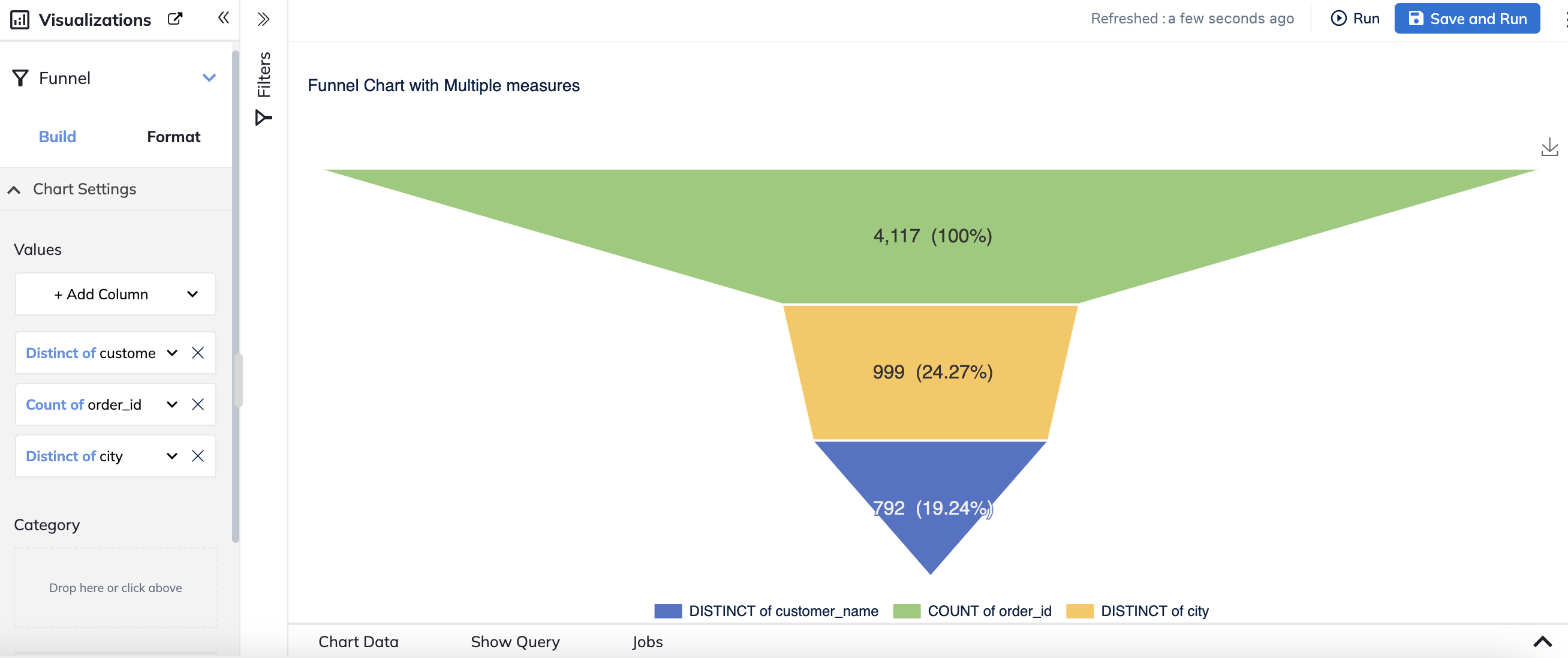
Note: The category field is disabled when multiple measures are used. It remains available only for single-measure funnels.
🔘 Single-Select Filters New Filter Setting:
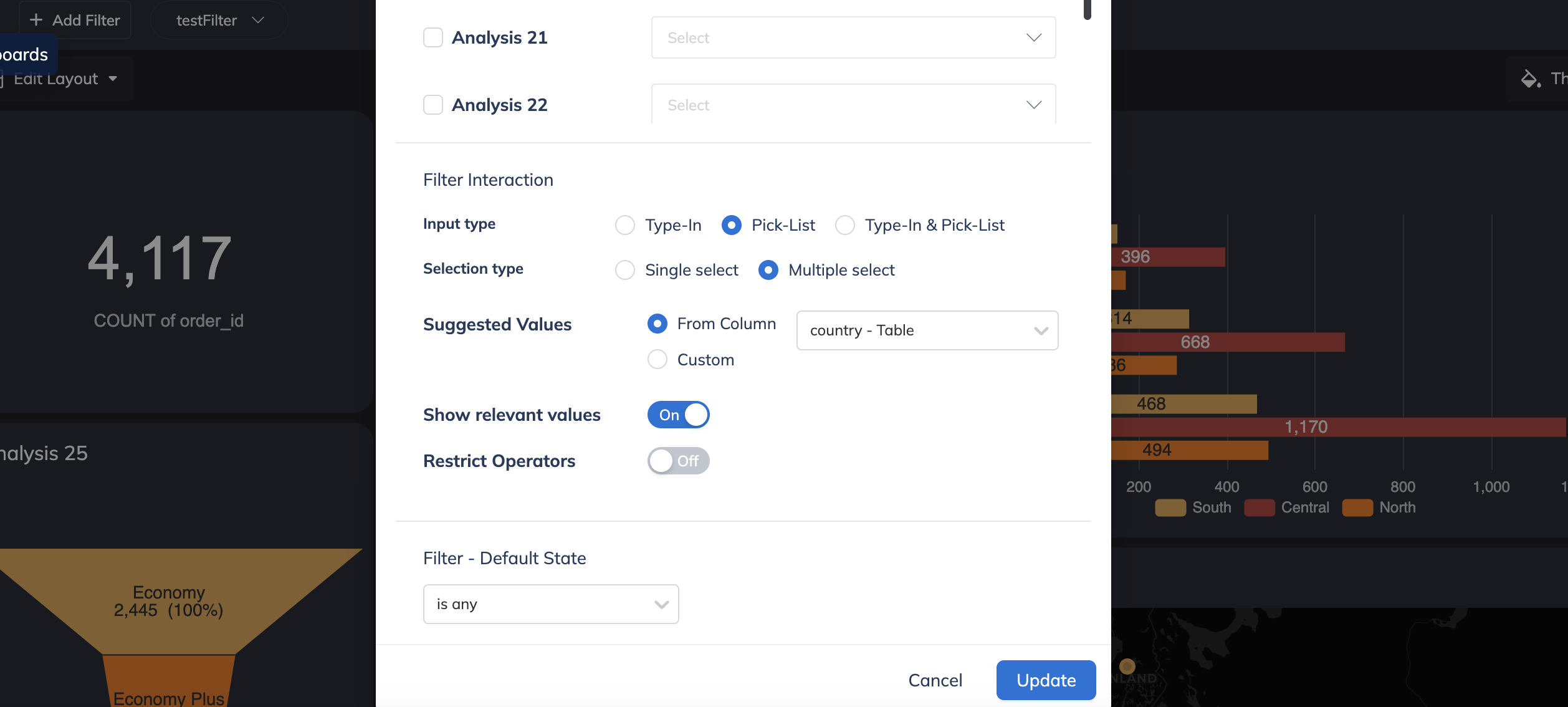
Section titled “🔘 Single-Select Filters New Filter Setting: ”You can now configure filters to be single-select at both the dashboard and report levels:
Dashboard Level:
Section titled “Dashboard Level: ”In Edit Mode, use the Add/Edit Filter modal to switch between single-select and multi-select options.
Report Level:
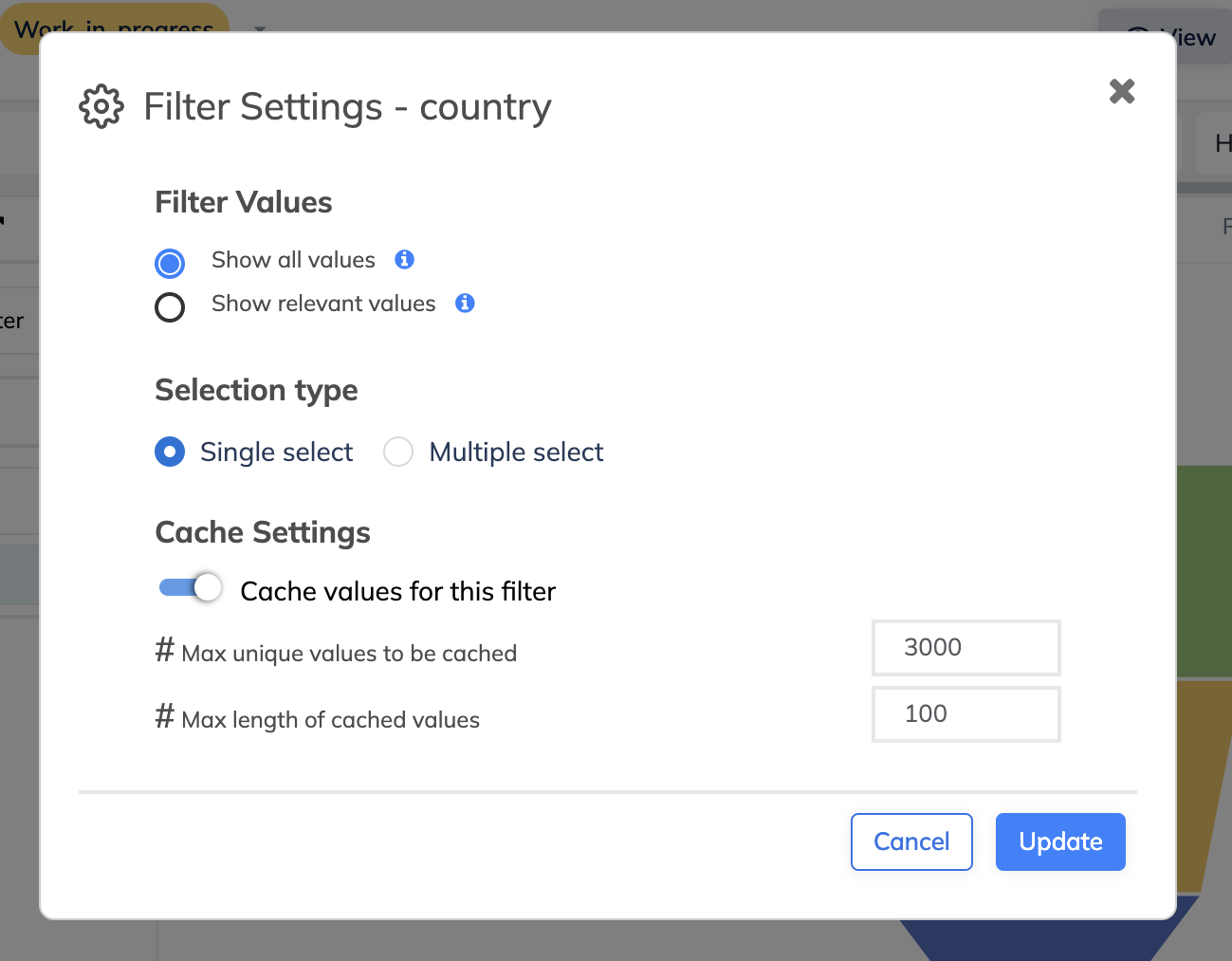
Section titled “Report Level: ”For SQL Reports,
- You can select the filter type in the Add Filter modal.
For Table & Model Reports,
- You can adjust the filter settings under “More Options” after adding a column to the filter section.
🔢 Total Labels for Stacked Charts:
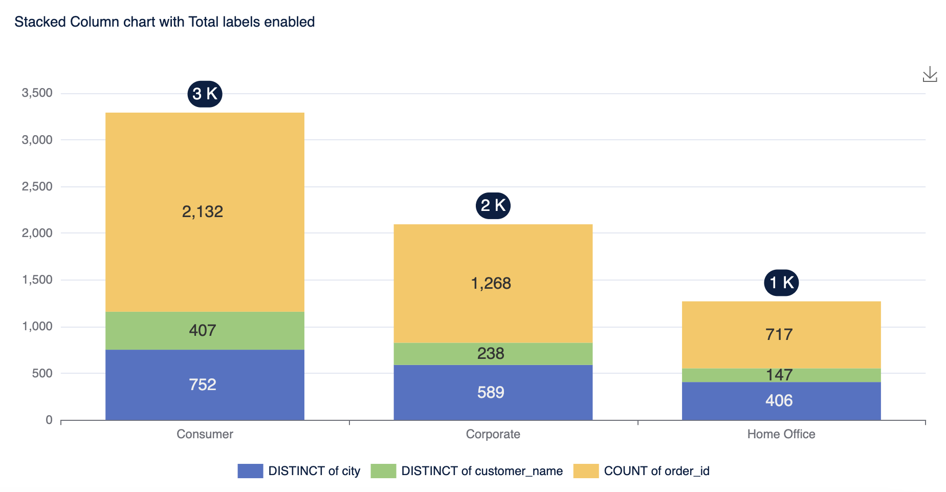
Section titled “🔢 Total Labels for Stacked Charts: ”- When using stacked bar or column charts, you can now display total labels on top of each stack to show the cumulative value.
- You can then customize the font size, color, background color etc to your liking.
- You can access this feature by Format -> Labels -> Global Settings -> Total Labels. Once you turn on the toggle for total labels you should be able to see them.
- You can see total labels only when stacking is enabled.
✨ We hope these enhancements improve your experience with Sprinkle.