Resized tile exampleComment
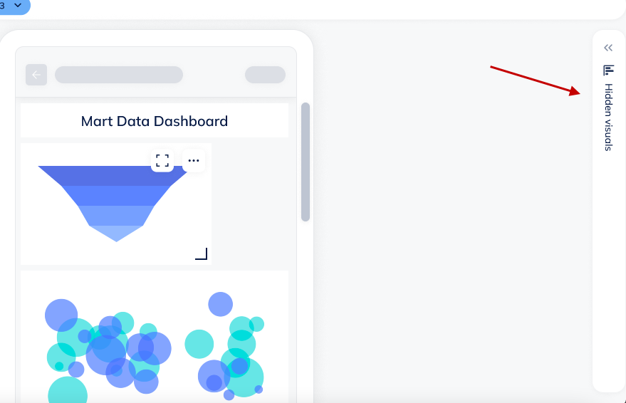
This is the area that users can set-up their tiles and edit layout acc to their preference.
Resized tile exampleComment
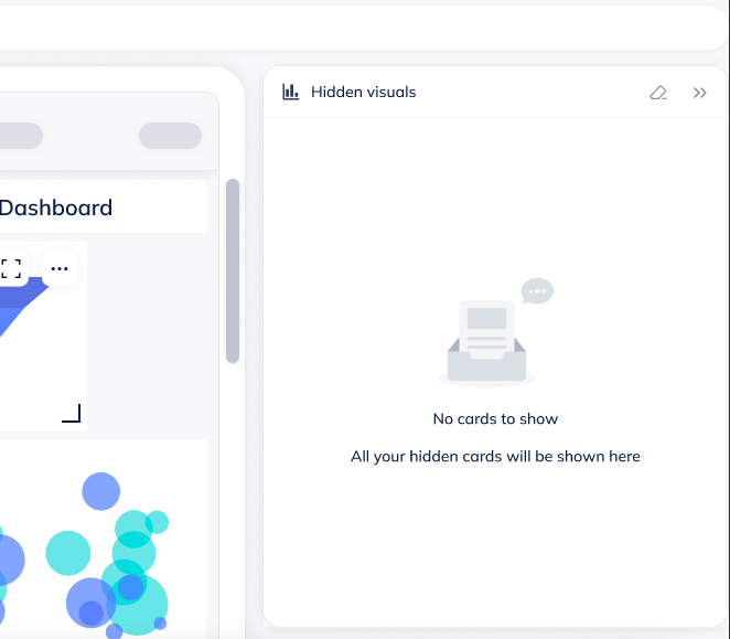
This is the area that users can set-up their tiles and edit layout acc to their preference.
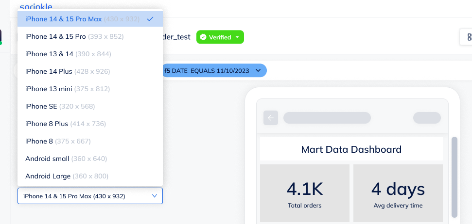
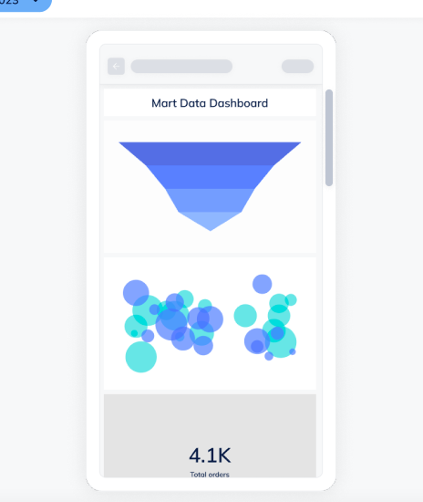
Device preview pop-over
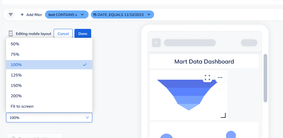
Zoom = 100%
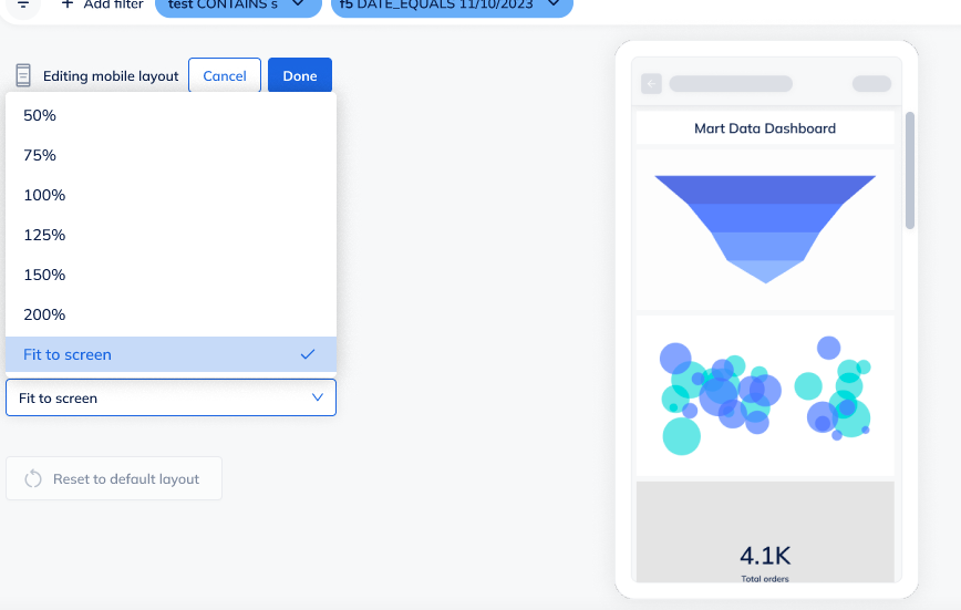
Zoom = Fit to Screen