Create a new Report
How to create a new report?
Section titled “How to create a new report?”- Click on Analyze from the navigation bar and navigate to Reports.
- Click on “+ Create Report” to create a new report.
- On the Build Report Using page - Choose Table, to build detailed reports using tables from your data warehouse.
- The Create Reports form opens up. Give a name to your report.
- Search and select the table from which you want to build the report.
- Click on Create
Build a Report from Table
Section titled “Build a Report from Table”Let’s suppose we have an e-commerce orders table and we want to build some analysis around that, like Total sales by Product Category, Sales by state, etc.
- Click on “+Create Report” and select the e-commerce_orders table
- On clicking on Create, you would land on the Edit View of the Report Builder UI.
- In the Input section, you can see all the columns that are present in the table.
- For example, let’s build a table consisting of category-wise total sales value. The table is the default visualization type.
- In the Build Section, Table Fields - there are two sections: Summarize and Group By.
- Drag Bill_value into the Summarize area. You may also click on “+Add Column” to add a column. When you drop a numeric column, the summarization is by default selected as Sum. You may change the aggregation type. But for our example, we need the sum of total sales by category, let’s leave the aggregation as Sum.
- Now drop Category into the Group By Area.
- :zap: Hit the Run button.
- And there you have the Total Sales by Category in the table format.
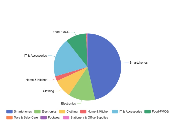
- Now, for example, you want to plot a pie chart for the Total Sales by Category. Click on Pie-Chart Visualization type on the top of the pane.
- Make edits to the chart settings if required, and :zap: Hit Run.
- And there you have the Pie chart of Total Sales by Product Category.
- Sample Output